Ever wonder if altcoin charts hide clues that could boost your trading moves? Think of these charts as simple maps that display quick snapshots of price changes and trading volume (how much of an asset is traded). By studying easy bar and line charts, you can pick up on clear signals that suggest the right moment to act. In this post, we break down how to read these clues, turning visual hints into straightforward trading strategies you can use every day.
Core Guide to Interpreting Altcoin Technical Charts
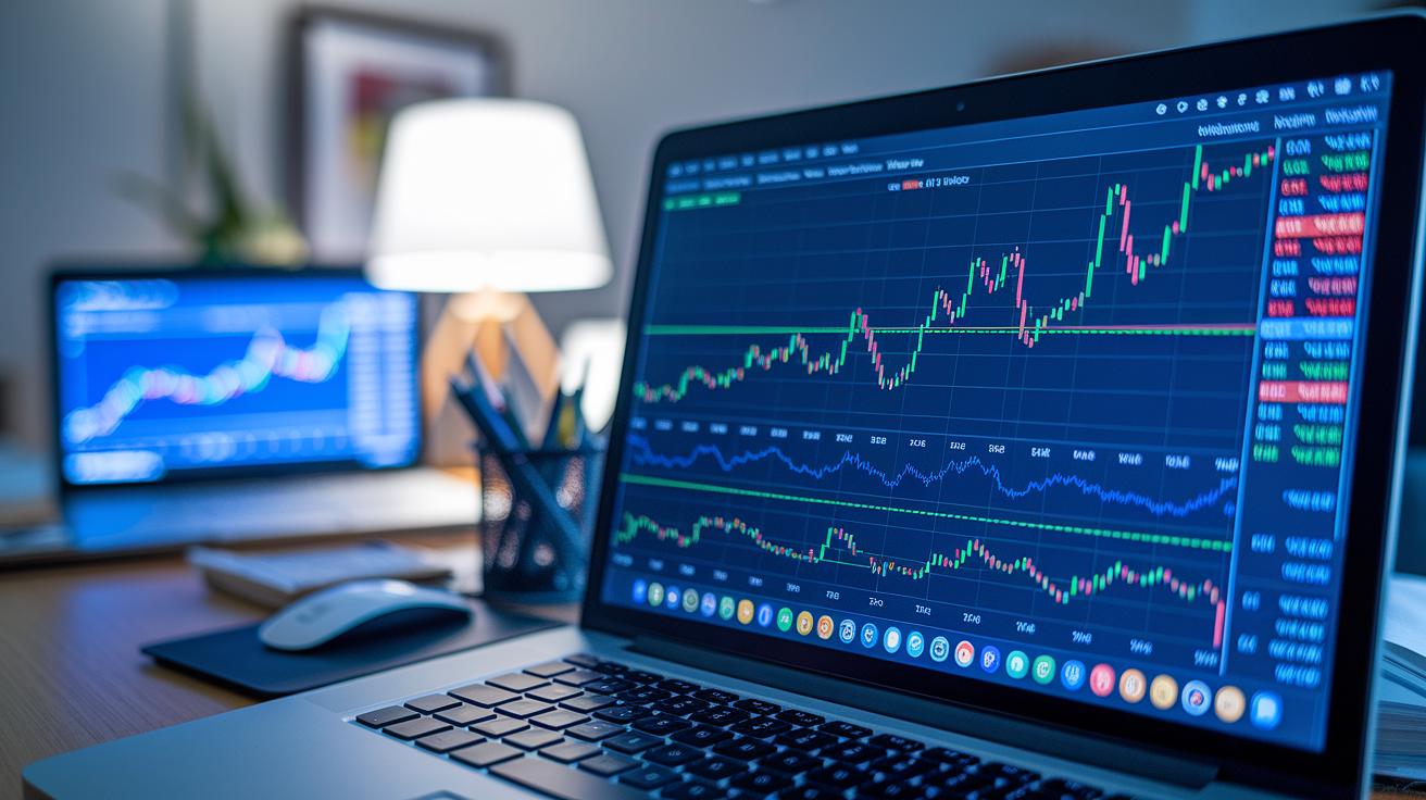
Technical charts are like a snapshot of an asset’s journey. They map out how a coin’s price and trading volume change over time. The horizontal line shows the passage of time, while the vertical one tracks price changes. Altcoin charts usually display the opening, high, low, and closing prices with clear vertical bars, so you get a quick picture of market movement. For instance, a simple line connecting closing prices can tell you at a glance if the asset's value has been climbing or dropping.
Traders use these charts to figure out the best moments to buy or sell. They look for patterns and key signals hidden in the data. From simple line graphs to detailed bar charts, these visuals help in spotting trends and shifts in momentum. In other words, even when the market gets a bit noisy, focusing on the right elements can clear things up.
| Component | Description |
|---|---|
| Timeframe | The period during which the data is recorded |
| Price axis | Shows how much the asset price fluctuates |
| Volume bars | Indicate how many units are being traded |
| Chart type | The style used to display the data, like line or bar charts |
By carefully checking these parts, traders can break down complex market data into clear, actionable insights. They review the chart’s timeframe, note how the price scale works, and look for volume spikes that might back up a trend. This method turns visual signals into strategic trading moves, ensuring that important price shifts and potential reversals don’t go unnoticed.
Comparing Line, Bar, and Candlestick Charts for Altcoin Analysis
When you're tracking altcoins, the right chart can really clear up what’s happening in the market. A simple line chart connects closing prices over time, giving you a smooth view of trends. But if you need more details, a bar chart shows the opening, high, low, and closing prices, which can be super helpful. Then there's the candlestick chart, which uses colors to signal market moods right away. And sometimes, you might even use a Heikin-Ashi chart that averages out prices to cut through the noise, making things look less chaotic.
| Chart Type | Data Display | Pros | Cons |
|---|---|---|---|
| Line | Closing prices over time | Simplifies trend direction | Misses intra-period price details |
| Bar | Open, high, low, close data | Offers comprehensive price info | Can look cluttered |
| Candlestick | OHLC with colored bodies | Quick visual cues on market mood | May be misinterpreted without context |
| Heikin-Ashi | Averaged price data | Smooths out volatility | Ignores specific open/close details |
Altcoin markets can be pretty wild. When prices jump around a lot, a Heikin-Ashi chart helps filter out the extra noise so you can see the longer trend more clearly. But if the market is calm, a candlestick or bar chart gives you the detailed look you need to pick the right moments to enter or exit. This means you're not just reacting to sudden spikes, but really understanding the data and matching it with how you trade.
Identifying Key Candlestick Patterns in Altcoin Charts
Candlestick patterns give us a quick peek into the market's mood, especially when altcoins are making rapid moves. They help traders spot signs of change that might hint at a trend keeping its course or about to flip.
Doji
A Doji shows up when the opening and closing prices are almost identical, leaving the candle with a very thin body. It tells us that the market feels uncertain, with buyers and sellers basically stuck in a tug-of-war.
Hammer
The Hammer comes with a long tail beneath a small body at the top. This pattern means that although prices dropped, buyers kicked in and pushed the prices back up. It often signals the chance of a bullish turn after a fall in prices.
Shooting Star
When you see a Shooting Star, notice a small candle body located near the bottom with an extended upper shadow. This pattern hints that sellers stepped in hard as the price peaked, which could mean a move to lower prices is on the horizon.
Engulfing
The Engulfing pattern, whether it suggests a bullish or bearish move, appears when one candle completely covers the previous one. This full takeover is a strong sign that market sentiment might be shifting in a big way.
Stars
Morning and Evening Stars are made up of three candles. They blend smaller candles with signals from their neighbors to give a trustworthy hint toward a reversal in the market.
Key factors to watch include:
- Volume check: Look for healthy trading volume behind the move.
- Timeframe alignment: Make sure the pattern fits the chosen trading period.
- Trend context: Examine how the pattern fits into the broader market trend.
- Candle color: Note the color as it helps indicate which side is in control.
- Wick proportion: Check how long the wicks are to understand the price reaction better.
Applying Moving Averages and Oscillators to Altcoin Trend Analysis

Moving averages help smooth out the ups and downs in altcoin prices so you can focus on the big picture of market trends. A Simple Moving Average, or SMA, calculates the average price over a set period, giving you a clear view of past performance. Meanwhile, an Exponential Moving Average, referred to as EMA, gives extra weight to recent prices. This makes it more responsive to changes. Many traders use both together to catch steady trends and quick shifts. For example, pairing a 50-day SMA with a 20-day EMA lets you see both long-term movements and sudden price bumps. It’s a balanced way to get clearer signals, especially when the market is moving fast.
Let’s break down a few core oscillators:
-
MACD – This indicator uses two moving averages. It spots possible reversal signals when the MACD line crosses the signal line. Think of it as a tool that hints at when trends may flip.
-
RSI – The Relative Strength Index, or RSI, scales from 0 to 100. A reading above 70 suggests an asset is overbought, while below 30 hints it might be oversold. It’s a handy snapshot of current market feelings.
-
Stochastic – This oscillator compares the current closing price to its recent price range. It helps point out shifts in momentum when values hit extreme highs or lows.
-
ATR – The Average True Range measures how much the price moves over time. In simpler words, it tells you about a coin’s price volatility, helping set realistic expectations in different market moods.
Mixing moving averages with these oscillators gives you a well-rounded toolset for confirming trends. When the moving averages show a clear trend and oscillators like the MACD and RSI back that up with clues on momentum and price swings, you’re looking at a thoughtful approach to market analysis. This method helps you avoid overreacting to brief price changes while making you feel more confident in your trading decisions.
Drawing Trendlines, Support, Resistance, and Fibonacci Levels on Altcoin Charts
These drawing tools can really clear things up when you're watching price action. They help you notice where prices tend to stop falling or rising, giving you a solid clue about what might happen next. Trendlines, for example, show you the overall direction by linking important high or low points. In the same way, support levels are where prices often bounce back up, while resistance levels mark where they usually struggle to climb higher. Fibonacci retracements add another layer by marking percentage points where prices might pull back, and pivot points offer useful benchmarks for day-to-day trades.
Start by spotting the most noticeable highs or lows in the price swings. Then, draw a straight line to connect these points, extending it into the future to signal where support or resistance might appear.
Fibonacci Retracement
Fibonacci retracement means plotting levels at 23.6%, 38.2%, 50%, and 61.8% based on the vertical gap between a big high and a big low. These levels act like checkpoints, showing you potential areas where the price might stall or reverse.
When a price gets close to one of these levels, it might be hinting at a pause or even a turnaround. Traders keep a close eye on these markers to decide when to jump in or get out, especially during sudden market swings. To nail down your analysis, remember to:
| Step | Description |
|---|---|
| Timeframe | Use a chart period that fits your trading style for reliable pivot points. |
| Calculation | Work with the previous period’s high, low, and close to determine the pivot points. |
| Confirmation | Check if other technical signals support the pivot point for extra confidence. |
| Adjustment | Regularly update your pivot points with fresh market data to keep them useful. |
Selecting Timeframes and Measuring Volume and Volatility in Altcoin Charts

When looking at altcoin charts, finding the right timeframe is all about striking a balance between catching fast price moves and seeing the bigger trend. Shorter timeframes, like 1-minute or 15-minute charts, let you spot quick changes but often pick up a lot of extra market noise. Longer timeframes, like daily charts, smooth out these small fluctuations and reveal more lasting trends. It really depends on your style, whether you like quick, snappy moves or a clearer overall picture.
- 1m: Offers a fast glimpse, though it might capture a lot of extra chatter.
- 15m: Balances speed and clarity but can still be a bit noisy.
- 1h: Gives you a clearer trend view while keeping things timely.
- 4h: Cuts through much of the noise and highlights swing movements well.
- Daily: Filters out short-term bumps, making it best for a long-term outlook.
Adding tools like the Average True Range (ATR, which shows you the typical price movement) can help you set realistic expectations. In combination with volume spikes that confirm a change, you get a solid way to read the charts. This mix of insights makes it easier to understand altcoin movements and time your trades with more confidence.
Building a Risk-Controlled Altcoin Trading Plan with Chart Signals
Crafting a solid trading plan means setting clear rules to manage risk and relying on chart signals for direction. When you have a plan, you avoid knee-jerk decisions that can cost you. For instance, using stop-loss orders placed right below a key support level or just above a resistance level gives you a clear exit point to keep your losses in check. You can decide on your position size using a fixed portion of your account or by measuring it with ATR (Average True Range, a simple tool to gauge price movement).
- Trend alignment
- Indicator confirmation
- Support/resistance
- Volume confirmation
- Stop-loss placement
Testing your strategy with past altcoin chart data is crucial. By backtesting, you’re basically comparing your signals to real market movements to see if your plan would hold up in different situations. Think of it like trying out a recipe before serving it to guests. When you check how your stop-loss orders performed against support or resistance zones and adjust your position sizes based on ATR readings, you sharpen your trading plan. This organized approach helps you catch clear trends while avoiding surprises from sudden market shifts. With a practical checklist in hand, you can confidently turn visual chart signals into rational trading moves.
Final Words
In the action, we've covered essential techniques, from reading price action and candlestick signals to applying moving averages and trendlines. We broke down how traders analyze each chart type, balance risk, and measure volume and volatility. Every point helps you feel more confident as you learn how to interpret altcoin technical charts. It’s all about stepping through the process, using clear steps and reliable data, to build a solid approach that keeps you positive and ready for what the market brings.
FAQ
How do you read crypto charts and technical charts in crypto?
Reading crypto charts means spotting trends and patterns through price and volume data. These charts show candlestick formations and indicators that guide you in finding key entry and exit points.
How do you interpret candlestick charts and crypto chart patterns?
Interpreting candlestick charts involves reviewing open, high, low, and close prices to reveal trends. Common patterns like doji, hammer, and engulfing signal shifts in market sentiment and momentum.
What is the function of Coinbase Advanced charts and login features?
Coinbase Advanced charts offer detailed technical views, while the login provides access to robust indicators. Both tools work together to help you monitor market shifts and improve your trading strategy.
What information does the GDAX depth chart provide?
The GDAX depth chart shows real-time buy and sell orders. It helps you assess market liquidity and understand the balance between supply and demand for more informed trading decisions.
How can you read the altcoin index and analyze altcoins?
Reading the altcoin index means reviewing performance metrics across different altcoins. Analyzing altcoin charts helps you identify trends and trading opportunities by comparing price movements and market data.
What role do platforms like TradingView, Coinbase, Binance, Bybit, Robinhood, and Webull play in crypto analysis?
These platforms offer a mix of charting tools, indicators, and trading features. They support both beginners and advanced traders in executing technical analysis and making insightful market decisions.

